Weather analysis
In this tutorial we use the Python Pandas and Matplotlib packages to analyse and visualise weather data. Time series graphs, scatter plots, histograms and box-and-whisker plots are created using matplotlib functions. Pandas functions are used to read the data file, display summary information and rename columns.
The data source used in this tutorial is from the Australian Bureau of Meteorology. We focus on the minimum and maximum daily temperatures for Adelaide, Australia, in the first three months of 2022 using data downloaded from the .
Note that the code from this tutorial is taken from a Jupyter notebook where commands are processed in cells and the results displayed. However this code can be easily adapted to run from a Python IDE such as IDLE or Pycharm. The main change required is to add a print statement to display table results, and a plt.show() command to display graphs.
.jpg)
Importing packages
This tutorial uses the Pandas package to read the data from the source file into a dataframe. Graphical representations of the data, including histograms, box plots and time series graphs are created using functions from the Matplotlib package.
import pandas as pdimport matplotlib.pyplot as pltReading the data
We begin by reading the weather data for January 2022. The following options are used:
- the dayfirst option lets the reader know that the dates are given in Australian/European format where the days are given first (by default the reader uses the US format where the month is written first).
- the parse_dates option indicates which columns should be converted into dates.
df1=pd.read_csv("data/IDCJDW5081.202201.csv", dayfirst=True, parse_dates=['Date'])Next we print out the first five rows of the data, restricting the view to the first three columns, which contain the date, minimum temperature and maximum temperature.
df1[0:5][df1.columns[0:3]]| Date | Minimum temperature (°C) | Maximum temperature (°C) | |
|---|---|---|---|
| 0 | 2022-01-01 | 22.5 | 33.6 |
| 1 | 2022-01-02 | 19.3 | 30.6 |
| 2 | 2022-01-03 | 14.1 | 25.9 |
| 3 | 2022-01-04 | 14.2 | 24.4 |
| 4 | 2022-01-05 | 14.4 | 21.5 |
Renaming columns
To make it easier to refer to the minimum and maximum temperature columns we rename the label for these two columns. Calling the info function then prints a summary of the data stored in the dataframe. Notice that the minimum and maximum value columns have been renamed.
df1.rename(columns={df1.columns[1]: "Minimum", df1.columns[2] : "Maximum"}, inplace=True)
df1.info()
<class 'pandas.core.frame.DataFrame'>
RangeIndex: 31 entries, 0 to 30
Data columns (total 21 columns):
# Column Non-Null Count Dtype
--- ------ -------------- -----
0 Date 31 non-null datetime64[ns]
1 Minimum 31 non-null float64
2 Maximum 31 non-null float64
3 Rainfall (mm) 31 non-null float64
4 Evaporation (mm) 0 non-null float64
5 Sunshine (hours) 0 non-null float64
6 Direction of maximum wind gust 31 non-null object
7 Speed of maximum wind gust (km/h) 31 non-null int64
8 Time of maximum wind gust 31 non-null object
9 9am Temperature (°C) 31 non-null float64
10 9am relative humidity (%) 31 non-null int64
11 9am cloud amount (oktas) 0 non-null float64
12 9am wind direction 31 non-null object
13 9am wind speed (km/h) 31 non-null object
14 9am MSL pressure (hPa) 31 non-null float64
15 3pm Temperature (°C) 31 non-null float64
16 3pm relative humidity (%) 31 non-null int64
17 3pm cloud amount (oktas) 0 non-null float64
18 3pm wind direction 31 non-null object
19 3pm wind speed (km/h) 31 non-null int64
20 3pm MSL pressure (hPa) 31 non-null float64
dtypes: datetime64[ns](1), float64(11), int64(4), object(5)
memory usage: 5.2+ KB
Time series graphs
The first graphs that we create are time series graphs, which will display the change in minimum/maximum temperatures over time. This is created using the plot_date function. This function takes two lines of the values – the first list corresponds to the dates in the Date column, the second list corresponds to the minimum temperatures column.
The autofmt_xdate function ensures that the dates are displayed in an appropriate manner.
fig,ax=plt.subplots()
ax.set_title("Minimum temperatures for January 2022")
ax.set_xlabel("Date")
ax.set_ylabel("Temperature (°C)")
fig.autofmt_xdate()
ax.plot_date(df1[["Date"]], df1[["Minimum"]], linestyle="solid", markersize=0)
[<matplotlib.lines.Line2D at 0x1da7f8a6a30>]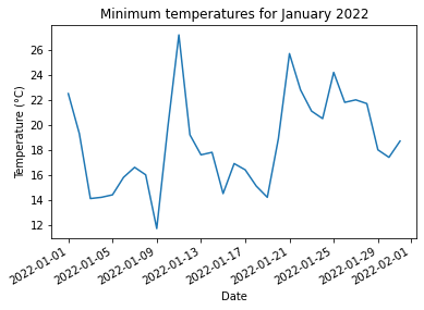
The same process is used to display the maximum temperatures over time.
fig,ax=plt.subplots()
ax.set_title("Maximum temperatures for January 2022")
ax.set_xlabel("Date")
ax.set_ylabel("Temperature (°C)")
fig.autofmt_xdate()
ax.plot_date(df1[["Date"]], df1[["Maximum"]], linestyle="solid", markersize=0, color="orange")
[<matplotlib.lines.Line2D at 0x1da7db9be50>]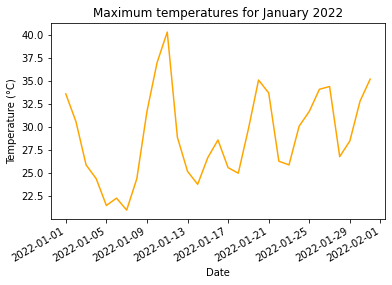
Scatter plots
Scatter plots can be used to compare two sets of data values. In this case create a scatter plot to compare the daily minimum and maximum temperatures.
fig,ax=plt.subplots()
ax.set_title("Comparison of maximum and minimum temperatures")
ax.set_xlabel("Minimum temperature (°C)")
ax.set_ylabel("Maximum temperature (°C)")
ax.scatter(df1[["Minimum"]], df1[["Maximum"]], marker="x")
<matplotlib.collections.PathCollection at 0x1da7dc8c160>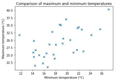
Combining data
Data can be read from multiple data sources and then combined into a single dataframe. For this example we combine the weather data from January 2022 with data from February 2022 and March 2022.
df2=pd.read_csv("data/IDCJDW5081.202202.csv", dayfirst=True, parse_dates=['Date'])
df3=pd.read_csv("data/IDCJDW5081.202203.csv", dayfirst=True, parse_dates=['Date'])df2.rename(columns={df2.columns[1]: "Minimum", df2.columns[2] : "Maximum"}, inplace=True)
df3.rename(columns={df3.columns[1]: "Minimum", df3.columns[2] : "Maximum"}, inplace=True)df=pd.concat([df1, df2, df3])df[df.columns[0:3]]| Date | Minimum | Maximum | |
|---|---|---|---|
| 0 | 2022-01-01 | 22.5 | 33.6 |
| 1 | 2022-01-02 | 19.3 | 30.6 |
| 2 | 2022-01-03 | 14.1 | 25.9 |
| 3 | 2022-01-04 | 14.2 | 24.4 |
| 4 | 2022-01-05 | 14.4 | 21.5 |
| … | … | … | … |
| 26 | 2022-03-27 | 16.9 | 31.8 |
| 27 | 2022-03-28 | 16.4 | 27.4 |
| 28 | 2022-03-29 | 12.5 | 24.0 |
| 29 | 2022-03-30 | 13.6 | 22.9 |
| 30 | 2022-03-31 | 14.6 | 21.0 |
90 rows × 3 columns
df[["Minimum","Maximum"]].describe()| Minimum | Maximum | |
|---|---|---|
| count | 90.000000 | 90.000000 |
| mean | 17.063333 | 28.116667 |
| std | 3.524344 | 4.399240 |
| min | 11.500000 | 21.000000 |
| 25% | 14.625000 | 24.400000 |
| 50% | 16.600000 | 27.550000 |
| 75% | 19.150000 | 31.775000 |
| max | 27.200000 | 40.300000 |
Histograms
Histograms are used to show the distribution of continuous data. In this section we create histograms to display the distribution of minimum and maximum temperatures.
We begin by creating a histogram to display the minimum temperatures.
plt.hist(df[["Minimum"]], edgecolor="k", alpha=0.4)
plt.xlabel("Temperature (°C)")
plt.ylabel("Frequency")
plt.title("Distribution of minimum temperatures")
Text(0.5, 1.0, 'Distribution of minimum temperatures')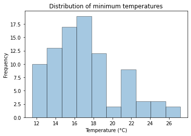
Whilst this graph shows the distribution of temperatures quite clearly, the automatic selection of bins (the lower and upper limits of each of the columns in the histogram) is not ideal. In particular it is difficult to see what the exact limits of the bins are. We can improve this by setting these values.
In the code below we set the bins for the minimum and maximum temperature histograms. This is done using a list comprehension.
minbins=[2*x for x in range(5, 15)]
maxbins=[2*x for x in range(10, 21)]minbins[10, 12, 14, 16, 18, 20, 22, 24, 26, 28]plt.hist(df[["Minimum"]],bins=minbins, edgecolor="k", alpha=0.4)
plt.xlabel("Temperature (°C)")
plt.ylabel("Frequency")
plt.title("Distribution of minimum temperatures")Text(0.5, 1.0, 'Distribution of minimum temperatures')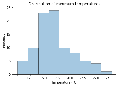
Combining graphs
Multiple graphs can be displayed using subplots.
In the example below we display histograms for minimum and maximum temperatures, showing the graphs side by side.
- The first argument of the subplots function defines the number of rows of graphs.
- The second argument of the subplots function defines the number of columns of graphs.
- The figsize option defines the size of the resulting figure containing the graphs. In this case the resultant figure will be 8 inches across, by 6 inches high.
- The sharey option indicates that the two graphs will share
the scale for y-axis.
The suptitle command sets a title for all graphs within the subplots.
fig, (ax1,ax2) = plt.subplots(1,2, figsize=(8,6), sharey=True)
ax1.hist(df[["Minimum"]], bins=minbins, edgecolor='k', alpha=0.4)
ax1.set_xlabel("Minimum temperature")
ax2.hist(df[["Maximum"]], bins=maxbins, edgecolor='k', alpha=0.4, color="red")
ax2.set_xlabel("Maximum temperature")
ax1.set_ylabel("Frequency")
plt.suptitle("Distribution of minimum and maximum temperatures")
Text(0.5, 0.98, 'Distribution of minimum and maximum temperatures')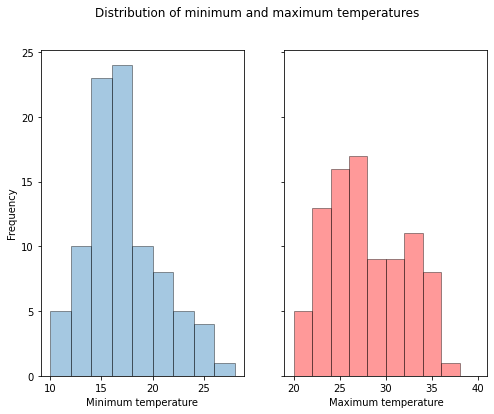
Box and whisker plots
Box and whisker plots are created using the boxplot function. In the following example we create box plot showing the distribution for minimum temperatures. The following options are used:
- vert determines whether or not to display the box plots vertically. In this case we set the option to false, meaning the boxplots will be displayed horizontally.
- labels takes a list of strings. These strings are used for the boxplot labels.
Outliers are displayed as a circle beyond the whiskers. In this case there is one outlier corresponding to the minimum temperature of 27.2°C.
fig, ax= plt.subplots()
ax.boxplot(df["Minimum"], vert=False, labels=["Minimum"])
ax.set_title("Minimum temperature distribution")
ax.set_xlabel("Temperature")
Text(0.5, 0, 'Temperature')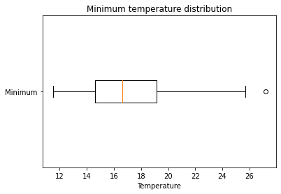
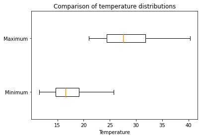
Parallel boxplots
Parallel boxplots are created by passing multiple lists of values to the first input of the boxplot function.
fig, ax= plt.subplots()
ax.boxplot(df[["Minimum", "Maximum"]], vert=False, labels=["Minimum", "Maximum"])
ax.set_title("Comparison of temperature distributions")
ax.set_xlabel("Temperature")
Text(0.5, 0, 'Temperature')
Hiding outliers
Outliers can be hidden in boxplots by setting the showfliers option to false.
fig, ax= plt.subplots()
ax.boxplot(df[["Minimum", "Maximum"]], vert=False, labels=["Minimum", "Maximum"], showfliers=False)
ax.set_title("Comparison of temperature distributions")
ax.set_xlabel("Temperature")
Text(0.5, 0, 'Temperature')